Letterpress printing is an immersive process. Days pass in inky smudges of concentrated work. ‘I see that real printing will devour one’s entire life’, wrote Virginia Woolf while experimenting with her new tabletop press in April 1917. ‘You can’t think how exciting, soothing […] and satisfying it is’. My own printing experiments were, at first, prompted by Woolf’s enthusiasm; while researching the influence of the nascent Hogarth Press on the development of her writing, I decided to purchase a second-hand Adana Eight-Five press and teach myself to print.
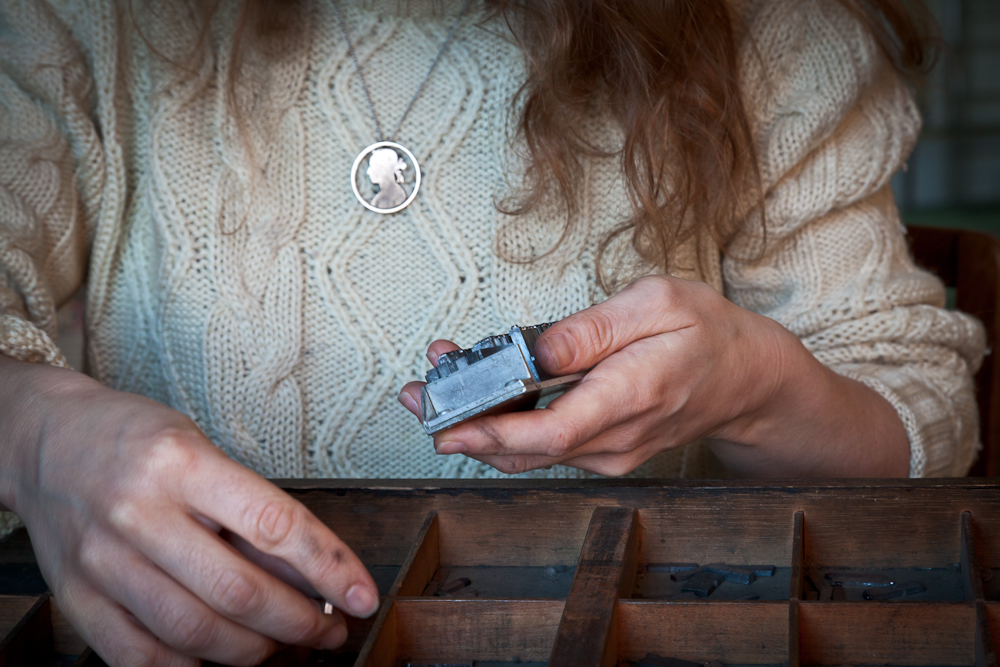
The days I spent becoming familiar with the techniques and technologies of printing were occupied in a state other than thinking. Yet the mesmerism of these manual activities also made me think about print, text and books more than ever. First, there is typesetting. Selecting individual letters, ‘sorts’, of metal type by hand from a type-case, and arranging them — back to front and upside down — in sequence on a composing-stick generates quite a different sense of a text than the usual mechanisms of reading. Each letter has a weight. You encounter the text physically; assembled in lead slivers, writing becomes material. Walt Whitman, who considered himself more a printer than a poet, described developing an ‘anticipatory eye’ working at the press: ‘[I] know pretty well as I write how a thing will turn up in the type – appear – take form’.
I’m still unsure whether setting type by hand involves a very intimate kind of reading, or not reading at all. The repetitive rhythm of composing the text letter-by-letter makes it difficult to grasp a sense of the whole; occupied by fractured words, I often feel too close to a text to read it. Instead, taking hold of one character at a time, I find my awareness drawn to the shapes of letters, to the visual properties of words. Too often, our regular reading habits encourage a blindness to the ways in which this textual visuality produces meaning. Writing creates an image, forming expressions that cannot always be rendered in spoken language. As readers, we are familiar with the tactile sensations of experiencing a book, but unless they call attention to themselves the visible curls, strokes, proportions and placements of the black shapes on a white page often remain unnoticed.
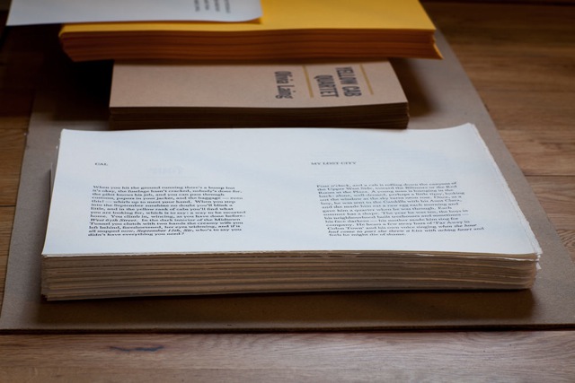
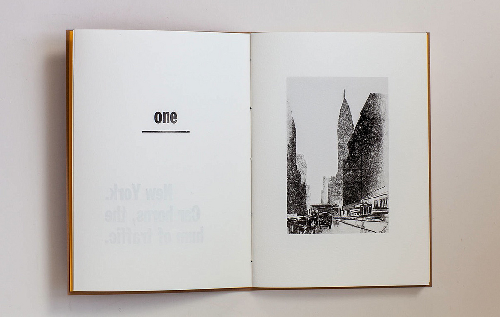
A few summers ago, I transported a full fount of 48 point Franklin Gothic back from New York City in my hand luggage. This heavy sans serif typeface, suggestive of billboards and newspaper headlines, underpins Yellow Cab Quartet, a limited edition letterpress printed book produced in collaboration with Olivia Laing earlier this year. Impressed into the printed pages of Laing’s ‘four tiny true stories’ about F. Scott Fitzgerald, John Berryman, Frank O’Hara, and Robert Lowell is a physical trace of New York. Conscious choices of typeface, space, and underline deliberately attempt to attach Yellow Cab Quartet to specific cultural bearings. The text is weighted by its visible appearance. A series of monotype drawings forge associative meaning across the thread-bound gutter, softly ushering interpretation. Urban canyons, alcohol-soused taxi journeys, monochrome portraits, the New York School. On the threshold mediating between text and reader, the paratexts of Yellow Cab Quartet inscribe contextual significance, reiterating and amplifying the verbal. The book is not a transparent container of ideas.
When the composing-stick is full, the set type is transferred to a metal galley to be assembled and arranged as a body of text, the forme. This forme is then locked within a chase, a rigid metal frame which is lifted into the press. This moment is perhaps the most precarious, since the compositions of type have to be tightened, using expanding quoins, with just enough pressure to be secure when the forme is picked up, but not so much that it buckles in opposition. If you do this wrong, it can all spill to the floor.
The body of each Yellow Cab Quartet vignette exhausted the contents of the type-case; you need a surprising quantity of type to make up a page. Among my leaden collection, I have several founts of 12 point Baskerville, cast to order. But I do not have enough to set a substantial portion of text, and, having plain run out of ‘e’s or ‘a’s, I am regularly forced to confront a limit. Small-scale printing involves constant reappraisal. When material restrictions are encountered, continuing often means compromising; making a spontaneous edit or improvising a sufficient solution. Several pages of Yellow Cab Quartet are, consequently, composed of two or three different formes, requiring two or three runs through the press. Slight adjustments — of paper position, ink volume, pressure — are made continually; the strain between uniformity and agreeable variation hangs an ever-present risk over the process. ‘You pit your faculties against concrete problems […] technical, mechanical problems. Which can be solved’, wrote Anaïs Nin, who in 1942 set up a small press to self-publish her third book. ‘At the end of the day you can see your work, weigh it. It is done. It exists.’ Once the page is printed, the forme is broken apart and each letter redistributed back into the type-case.
In its minute weights of ink, the letterpress printed page is marked with the traces of the book’s maker. The impressions of conspicuous production are visible in the variations and deviations, the irregularities and imperfections. Each page, having been cut by hand, is passed through the press — one hand-fed sheet at a time — at least once on each of its sides, before being folded by hand with a bonefolder, collated, trimmed, and bound with a needle and thread. But these manual techniques generate a struggle, a tension between the values of production and the production of value. I do not want to make books to be looked at rather than read. The made object must demonstrate enough ‘value’ not to be dismissed from aesthetic notice, yet the standards of its making should not simply reiterate and fortify the standards of the mainstream market for consumables. The well-made book cannot be made too well.
With the advent of electronic media, the book has become an object of fatal prediction. Digitally reproduced text — designed on a computer using digitised font — is immaculate, exact, and pervasive; manually printed matter is redundant. The book is dead. Yet in this partially dematerialised environment, the handmade murmurs its evergreen promise to reconnect us with all that modernity steals away. The modern person only works at what can be abbreviated. Letterpress printing, once the mechanical means of mass reproduction, is lately repositioned as art, the dedicated work of the artist. The inefficiencies of traditional production afford cultural value and arouse curiosity. Surrounded by digitized sheen, the ‘authentic’ book — a personal and direct form of individual expression — might be resuscitated by the trace of the hand. But this is stepping dangerously close to anachronistic conservatism, to Ruskin’s pre-industrial ideal. After all, the programming involved in producing an e-book is as labour-intensive and specialised a craft as letterpress printing. Codes, interfaces, and platforms require devotion and dexterity, but this labour is concealed in the commodity. In fixating on the onerous practices of manual making we might miss the point; it is the specificity of the product, not the process, which is of consequence.
As a maker of books that call attention to their physicality, I am concerned with reclaiming the enduring and material from the disposable and digital; resisting the digitization of all our interactions with reading. Practices like mine are not at odds with the digital text environment, but they might foster questions about what is surrendered by new reading technologies. With its standardised devices and default displays, what might be lost when a text is only available in digital form? What is not communicated? The screen ventures to become a transparent container.
There is an edge to the page of a physical book. A brink. Here, authorship is demarcated, the boundary of inside and outside the text delimited. Each copy of Yellow Cab Quartet is unique as a visible object; each copy reveals the circumstances of its individual production. It is not available in other formats, ringing duplicated, distilled, and decontextualised around the echo chamber of the internet. Neither its production nor its reception are anonymous; the experience of both being resolutely embodied, handheld. It is not ‘content’; it is a book, each page of which can be referenced externally in a weight of metal type. There are only one hundred copies. It is done. It exists.


To comment on an article in The Junket, please write to comment@thejunket.org; all comments will be considered for publication on the letters page of the subsequent issue.